I'm more a fan of pie charts, but line graphs are fun too.
Here are two that aren't so fun. From "A Comprehensive Assessment of the
Bush Administration?s Record on Cutting Taxes" by the Center on Budget and Policy Priorities.
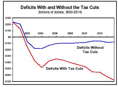
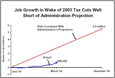
So when you see the president and his cronies on TV smirking and congratulating themselves on a few thousand new jobs being created, keep these in mind.